First Bank App Redesign
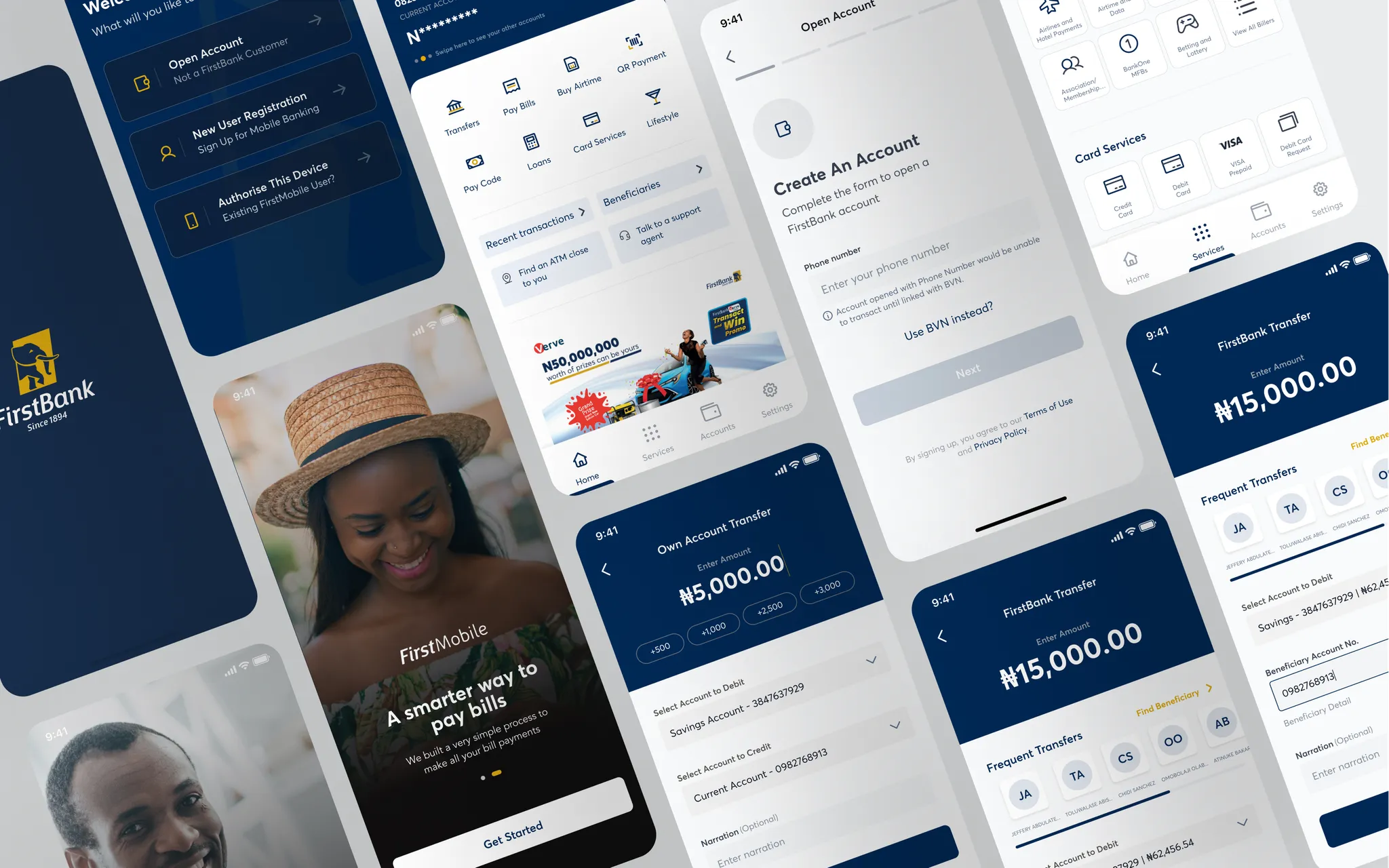
Revamping First Bank of Nigeria's mobile user interface.
- Role
- UX Designer
- Year
- 2022
- Client
- First Bank of Nigeria (via Interswitch)
- Duration
- 8 months
( Overview )
First Bank Nigeria is one of the oldest and largest banks in the country, with a wide range of financial products and services — but its mobile app received negative feedback for a confusing, outdated interface.
- Role
- UX Designer
- Timeline
- 8 months
- Deliverables
- UX Research, Wireframes, Prototypes, UI Design
- Goal
- Improve the user interface and experience of First Bank's mobile application to increase customer engagement and drive app adoption.
Background: First Bank Nigeria is one of the oldest and largest banks in Nigeria, with a wide range of financial products and services. However, their mobile application received negative feedback from users due to its confusing and outdated user interface.
( The Challenge )
First Bank's mobile app had strong brand recognition but weak user engagement.
Customers struggled with:
- Confusing navigation and cluttered layouts
- Repetitive, error-prone transaction processes
- Poor onboarding experience leading to high drop-offs
The redesign aimed to modernize the experience, make everyday banking simpler, and rebuild trust among customers.
Goals:
- Improve the user interface and experience of the mobile application to increase customer engagement and satisfaction.
- Increase adoption of the mobile application by First Bank users.
( My Design Process )
I began by understanding how real customers were using the First Bank mobile app and where they struggled. Through interviews and task-based usability testing (facilitated by the contracting company), I identified three consistent patterns:
- Users needed clarity and confirmation. Failed transactions and missing receipts often left them uncertain about payment status.
- The onboarding process was overwhelming. Too many disconnected steps caused frustration and drop-offs.
- Navigation required too many taps. Users wanted faster access to frequent actions like transfers and balance checks.
These findings shaped every decision I made throughout the redesign. I then proceeded to map out key friction points, restructure major flows, and focus on simplifying high-frequency actions such as transfers and account views. Using low-fidelity wireframes, I tested early concepts with users to validate clarity and confidence at each stage.
( The Solution )
- 1. Simplified Onboarding a new guided registration flow reduced friction and helped users complete setup faster: 84% of test participants completed onboarding unaided, up from 40% on the old app.
- 2. Clearer Transactions & Receipts rebuilt transaction and receipt screens improved readability and feedback. Users reported fewer transaction errors and a stronger sense of trust.
- 3. Streamlined Navigation a cleaner home screen and dedicated account section helped users locate actions faster. 5 out of 6 test participants described the new interface as "easier to use."
- 4. Refreshed Visual Language a modern, minimal interface improved accessibility and created consistency across the app.
Old Interface
Solution
( Impact )
While the final rollout was still in progress, early testing and feedback suggested:
- 30% expected reduction in customer support calls related to failed transactions.
- 20–25% projected increase in app adoption from survey feedback.
- Higher accessibility and inclusivity with biometric login and a clearer hierarchy.
- Potential improvement in app store ratings from 3.2 to 4.0 stars post-launch.
( Validated Outcomes via User Tests )
As of the time of me leaving the company, the product had not been completed, but here are outcomes and learnings gotten from initial user testing (testers were provided by the contracting company).
- Improved transaction success and clarity by the redesign of transaction history and receipt generation flow; users in testing reported fewer errors and a higher sense of trust in being able to track their payments.
- Reduced onboarding friction by streamlining registration flows from multiple disjointed steps into a guided process, validated through usability testing where 84% of test participants completed registration without assistance (compared to 40% on the old app).
- Simplified navigation and reduced cognitive load by introducing a cleaner, minimal home screen and dedicated account section; 5 out of 6 participants in testing described the redesigned interface as "easier to use" than the old version.
( Projected Business & User Impact )
- Anticipated reduction in customer support calls by 30%, particularly for complaints related to failed transactions and missing receipts.
- Expected increase in mobile app adoption rates by 20–25%, based on user survey responses showing higher intent to use the redesigned app over competitor apps.
- Improved accessibility and inclusivity with clearer visual hierarchy and biometric login options, expected to raise customer satisfaction (CSAT) scores by at least 15% within the first 6 months post-launch.
- Designed with competitive benchmarking in mind, putting First Bank's mobile app closer to industry leaders, which could positively impact app store ratings (from 3.2 stars to 4.0).
84%
Completed onboarding unaided, up from 40%
5/6
Testers called the new interface "easier to use"
30%
Expected drop in support calls for failed transactions
3.2→4.0
Potential app-store rating improvement
Next project
Cloud Infrastructure